Design

Responsive Design, Usability, Photography, Typography

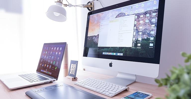
Our eyes are spoiled nowadays and at the same time often visually overstimulated. Developing a good Responsive Design for web sites that sensibly takes into account the technical conditions of the Internet and the user experience on a wide variety of small and large mobile devices, represents you optimally and encourages sales, requires specialised knowledge and a lot of experience. This knowledge goes far beyond that of a classic graphic design education.

With our many years of experience in precisely this area, we will be happy to create an individual Responsive Design for your website, which we will develop in close consultation with you and which will look good on all mobile devices and a wide variety of web browsers to be considered. We also take into account that you can later update your content flexibly and that your customers can also find it optimally via search engines.

We have a variety of mobile devices such as smartphones and tablets of different manufacturers and operating systems, tools for automated testing of mobile layouts on these devices to ensure a consistent and media-appropriate presentation of your design.

What makes a good Responsive Web Design?

Good Responsive Web Design is characterised for us by the following features:

  • Flexible layout: A responsive design adapts to different screen sizes and devices, from desktop computers to tablets and smartphones. The layout should adapt automatically and ensure optimal display on all devices.
  • Fluid column system: A well-designed responsive design uses a fluid, i.e. non-fixed pixel-based, column system that divides content flexibly and proportionally. This allows elements to be rearranged and scaled smoothly on different screen sizes.
  • Mobile-first approach: When creating a responsive design, the focus should be on mobile display. The design should be optimised for mobile devices from the start and then expand to larger screens. This ensures that the user experience is optimal on mobile devices. Google also indexes all content according to the mobile-first approach today, so this approach also has a positive impact on search engine rankings.
  • Images and media: Images and media should also be designed responsively to adapt to different screen sizes. This can be achieved by using appropriately flexible CSS layouts and using flexible images and videos.
  • Fast loading times: Good performance is also an important aspect of responsive web design. The website should load quickly, regardless of device size. This can be achieved by optimising images, minimising CSS and JavaScript files and using caching mechanisms.
  • Usability: A good responsive design takes into account usability on different devices. Navigation should be intuitive, links and buttons should be easy to touch and likewise not too small or close together for finger operation, and content should be legible and accessible.
  • Browser compatibility: The design should be consistent and functional across different web browsers. It is important to ensure that the responsive design displays properly in the most popular browsers. This is a matter of course for us
  • Test and optimise: A responsive design should be tested and optimised regularly to ensure that it works smoothly on all devices and in different environments. Testing on different screen sizes and devices is essential to identify and fix potential problems.

Good Responsive Web Design ensures that websites provide an optimal user experience on all devices, regardless of screen size or device type. It ensures a high user experience, good performance and seamless content presentation. We have many years of pro

Time for a new web design?

Write us a message or call us directly at +49 4104 960039 and let's talk about your project!
 

Request now!


Competences

  • Concept
  • Wireframes
  • Photoshop / XD final artwork
  • Responsive Design
  • Corporate Design / Logo Development

Some of our happy clients